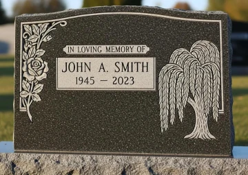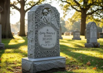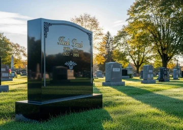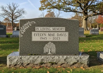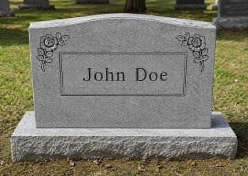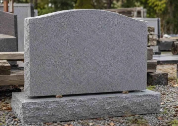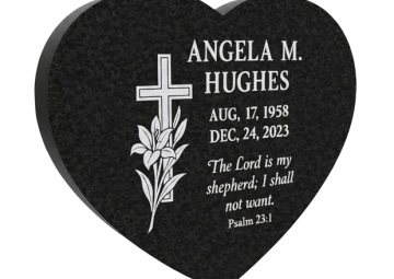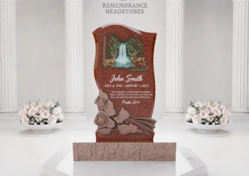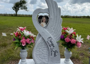
Nearly every serif letter in the Western world descends from an inscription. The capitals carved into Trajan's Column in Rome around 113 AD - brush-drawn first, then chiseled - remain the model type designers study two thousand years later, which means the lettering trade did not borrow from memorial carving. It began there. Headstone fonts are the oldest continuously practiced typography on earth, and a family choosing lettering today is standing at the end of a line that runs through Roman forums, colonial slate carvers, and the pattern books of the great granite sheds.
Remembrance Headstones treats that inheritance as a working discipline rather than trivia. Our design studio sets lettering for monuments across fourteen locations in eight states, from Sacramento and Houston to Essington outside Philadelphia and Tukwila near Seattle, and the fonts conversation in our private consultations goes deeper than a dropdown menu - into how a letter is cut, how styles pair on one stone, and how scripts beyond the Latin alphabet are honored properly. This article is that consultation, written down.
The Headstone Font Lineage Every Cemetery Quietly Displays
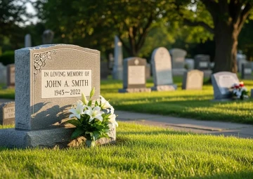
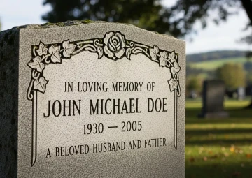
Walk any older burial ground and the history of the headstone font reads in rows. The colonial carvers of Pennsylvania and the Carolinas worked in vernacular hands - each shop's letters slightly its own, spiky, personal, learned at a master's bench. The nineteenth century industrialized the trade and standardized the letter: the deep Roman capitals of Victorian monuments, formal and confident, built for marble and then for granite. The early twentieth century gave the industry its own working typefaces - condensed Romans engineered for sandblast stencils, the sturdy monument letterforms old-timers still call by their shed names, Vermarco chief among them, drawn specifically so a blasted V-groove would hold its shape in stone.
What survived that whole journey is instructive. Serifs survived, because the small feet at a stroke's ends widen exactly where a cut letter is most fragile. Generous proportions survived. Fashion's thinnest and most ornamental letters did not - they weathered into ghosts within a generation, and the cemeteries kept the receipts. When our designers steer a family toward the classical families, it isn't conservatism. It's two centuries of field testing, visible from any gravel path.
Fonts for Headstones and the Four Ways a Letter Enters Stone
Here is the chapter most font guides skip entirely, and the one that changes how you choose: the cutting method matters as much as the letterform, because the same alphabet behaves like four different alphabets depending on how it meets the granite.
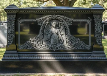
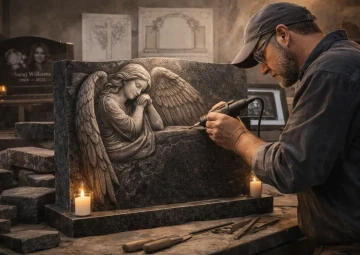
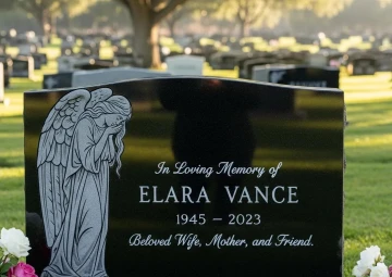
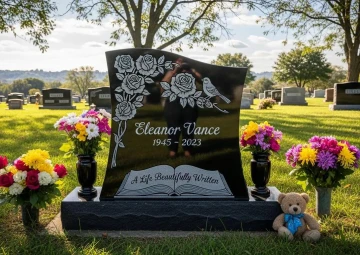
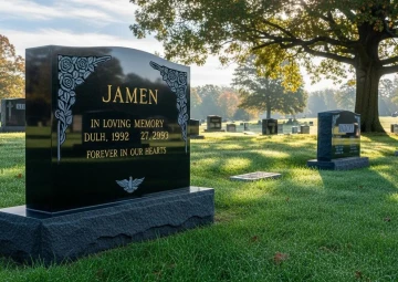
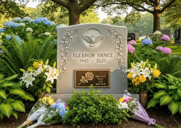
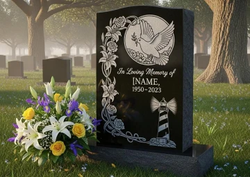
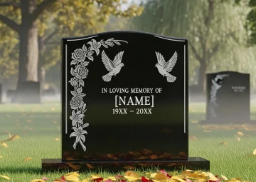
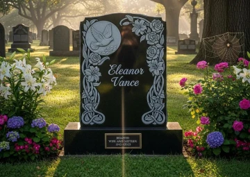
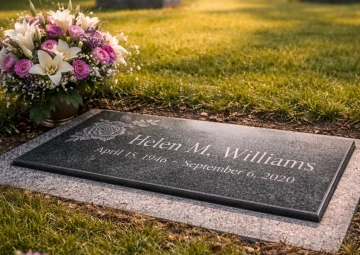
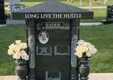
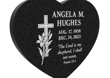
V-sunk cutting - the classic - carves each stroke as a valley with two angled walls meeting at a point, so the letter is drawn by shadow and reads differently at nine in the morning than at six in the evening. It is the most sculptural of the methods and the most permanent, and it favors serif Romans whose strokes are built for it. Frosted or sandblast panel lettering removes the polish inside each letter, leaving a pale matte character against the mirror surface; on black granite the contrast is superb and fine detail thrives. Laser etching draws the finest line of all - hairline scripts, signatures, lettering inside artwork - though shallow by nature, it belongs to polished dark stone and to inscriptions meant to be read up close. And raised lettering reverses the whole logic: the background is cut away and the letters stand proud of the stone, the most labor-intensive method and the most monumental, the choice for surname banners on estate work and the classical look of the grandest older memorials.
Gilding and color fill add a final layer - genuine gold leaf or lithochrome worked into cut letters, a tradition strong in Orthodox and European-heritage communities and standard on many of our Asian monument designs. Choosing fonts for headstones properly means choosing the cut alongside the letter, and a good studio presents them as one decision. Ours does, with samples of all four methods on the consultation table, because fingertips understand this chapter faster than paragraphs do.
Best Fonts for Headstones When Two Styles Share One Stone
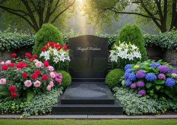
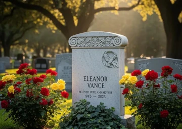
Most monuments carry more than one letterform, and the pairing is where composition lives. The surname in one voice, given names in another, the verse in a third - handled well, the hierarchy guides the eye the way a well-set book page does; handled badly, the stone argues with itself. The studio rules we work by are few and old. Pair contrast, not competition: a strong Roman surname over a flowing script given name works because the two styles do different jobs, while two similar-but-not-identical serifs merely look like a mistake. Let one voice lead. Give the script the name and the Roman everything else, never the reverse - script dates and script verses tire the eye fast. And keep the count at two, three at the absolute most, the third reserved for something small and deliberate, a monogram or a single word.
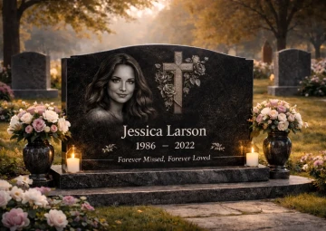
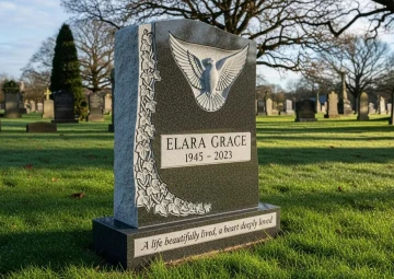
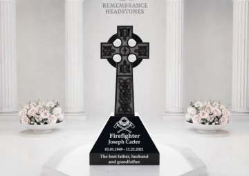
The best fonts for headstones in a pairing role, from our commission files: deep Roman capitals over a monument-grade connected script remains the classic marriage and earns its ubiquity. Old English surnames over clean Roman text suits heritage families and needs breathing room to work. Modern sans-serif compositions - one weight, letterspaced capitals, almost architectural - have grown steadily in our contemporary and Asian collections, where restraint is the style. Whatever the pairing, the proof shows it assembled, because hierarchy is invisible in a font list and obvious on a rendered stone.
Fonts for Headstone Inscriptions Beyond the Latin Alphabet
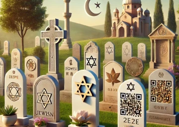
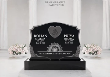
A premium lettering studio earns the word in the scripts it refuses to approximate. Our monuments carry Hebrew set right-to-left with correct final letterforms for Jewish memorials, where the traditional abbreviations opening and closing an inscription have fixed forms a designer must know, not guess. Arabic calligraphy for Muslim headstones, where a Quranic verse is not typed but composed, its ligatures and diacritics reviewed before any cutting. Cyrillic for the Russian, Ukrainian, and Serbian families our Sacramento and Roseland studios serve constantly, with Church Slavonic styling available where Orthodox tradition asks for it. Chinese, Vietnamese, and Korean characters on our Asian shaped monuments, set with stroke-order-correct forms and, often, gilded in the tradition's manner.
Bilingual stones are their own composition problem - English and Chinese sharing one face, Hebrew above and English below - and the fonts for headstone work in each script must balance visually against its partner, which is a designer's judgment no software makes alone. The standard is simple to state and demanding to meet: a native reader standing at the finished monument should find nothing to forgive. Families bring us photographs of relatives' stones from the old country to match, and we take those photographs seriously. Lettering is heritage in its most compressed form.
Headstone Font Examples Across Recent Commissions
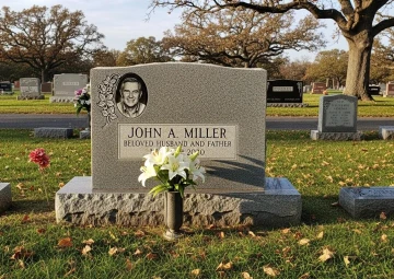
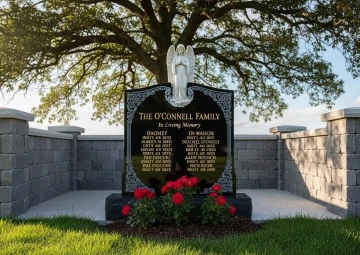
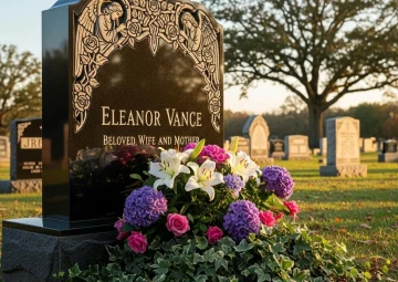
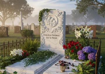
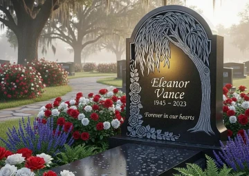
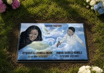
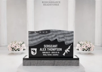
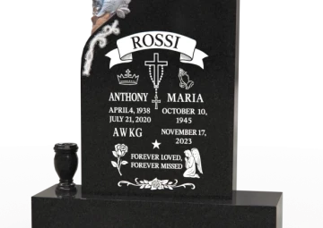
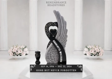
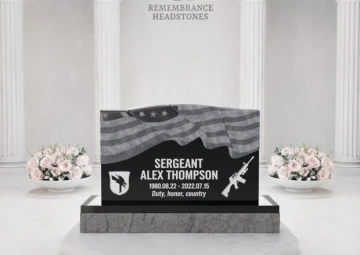
Cases teach faster than categories, so a few headstone font examples from the studio's recent work, details altered for privacy. A Laguna Woods estate monument: raised-letter surname in Roman capitals across the top - cut in relief, standing off the stone - with V-sunk given names and a frosted verse panel below, three methods layered into one calm composition. A Houston companion stone in polished black: the couple's names in a connected monument script, gilded, over etched portraits, with dates in quiet letterspaced capitals that never compete with the faces.
An Orthodox family monument near Roseland: Cyrillic in a traditional style with gold-filled incisions and the three-bar cross, matched from a 1960s photograph of a grandmother's stone in Lviv. A contemporary Asian shaped memorial in Tukwila: family name in Chinese characters, gilded, English beneath in a single sans-serif weight, the whole face set with the discipline of a good book cover. And a child's marker in Orlando that carries only a first name - in the mother's own handwriting, digitized and cut - which is not a font at all and outreads every typeface in this article. The lesson across all five: the letter serves the life. Choose in that order.
Testing the Lettering Before the Chisel Moves
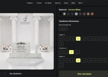
Every choice this article describes can be rehearsed at full scale before anything is permanent. The configurator on each product page at remembranceheadstones.com sets your actual names in the actual letterforms on your chosen granite, rendered in 3D as you switch between styles - and the AR preview then stands the finished monument in front of you at true size, on the plot itself if you're there, where the difference between two Romans finally becomes visible the way it never is in a menu. Lettering is the detail families squint at hardest in the AR view, and the squinting is the point. Read the stone from ten feet. Read it from thirty. The right font announces itself at both distances.
The formal proof follows, prepared by the studio with spacing set by hand - kerning a carved AV pair tighter than software wants, sizing the name to the stone rather than filling the space - and two revision rounds are included free, which inscriptions use more than any other element. Lettering itself is part of the monument's price, not a line item; what you are choosing is composition, not cost. Cemetery lettering rules, where they exist, are verified by our team before production along with everything else.
The Quiet Economics of a Well Set Name
The financial chapter stays short because the craft carries this article, but families deserve the numbers plainly. Standard inscription in any of the letterforms discussed is included with the monument. Specialty work - raised lettering, gilding, extensive multilingual composition - is quoted transparently in the proof, priced by the hours of hand-finishing involved. The current structure at Remembrance Headstones: 10% off with full payment, 20% for veterans and 15% for first responders paying in full, Klarna and Affirm financing to 24 months, 0% in-house plans to 12, pre-need arrangements to 36 months interest-free with free storage and locked pricing, and a 10% price match behind it all. Through July 31, the Independence Day offer adds 25% off for two or more monuments with full payment.
The consultation rooms hold lettering sample boards in all four cutting methods - Sacramento, Los Angeles, Laguna Woods, Hesperia, Houston, Allen, Dickinson, Tulsa, Edmond, Enid, Essington, Tukwila, Roseland, Orlando - and remote families across New York, Illinois, Ohio, the Carolinas, Kansas, Washington state, and Arkansas work through the same studio with the same previews. Run a finger along a V-sunk Roman and a frosted script side by side. Two thousand years of the trade sit in that half-inch of granite, and choosing between them, it turns out, is not hard at all. One of them will simply sound like the person. That's the one.